Mastering React: Techniques to Take Your UI to the Next Level
From Styling to Functionality, Tips and Code Examples for Crafting a World-Class Navigation Bar
UX designers strive to give applications a unique personality and a smooth user experience. As a developer, you can elevate your UI to the next level by paying attention to the details. One of my favorite lines about building great User Experiences is from the manifest of The Browser Company of New York:
When we build software, it’s an opportunity to make people feel something. It doesn’t need to be anything major. […] Just that we might make them smile, laugh, see or realize something they didn’t before. […] You leave your fingerprints behind, so that they know it was made by another person and that person cared.
This article by the Neilson Norman Group highlights how certain motion effects can not only be eye candy but help communicate state changes and navigation.
The goal of this post is to walk through the process of engineering the small details to get that flawless experience. We’re going to try to perfect a Navigation Bar for a web app in React.
From Design to Concept
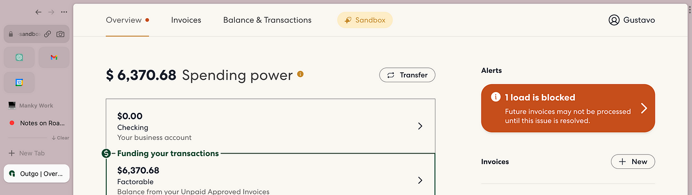
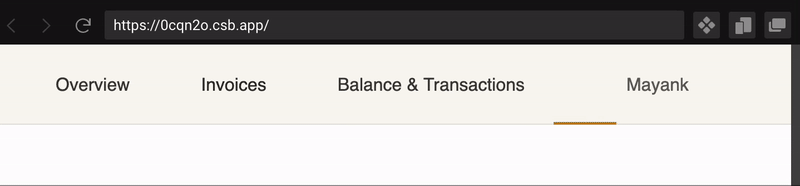
Let’s say you get a Figma file from your designer that has a navigation bar something like this:

As you may have guessed, 90% of the navigation bar looks simple to implement. Change the text color on the hover state, and change it again on the active state. Pretty straightforward.
However, the active state highlight marker at the bottom with the animation looks like the tricky 10% part of this project.
Initially, I planned to simply show and hide the highlight on the active Navigation Link without any motion animations. Pondering, I decided to dig a little deeper into figuring out what the 10% polish looks like on all the great web apps you encounter on a day-to-day basis.
To help you achieve the desired effects, I’ve split this post into five sections, each with a CodeSandbox showcasing the progress up to that point. I encourage you to experiment with the code and try out the techniques yourself.
Enjoy :)
Part 1: 90% there — “B- to B”
So, how do we begin?
First of all, let’s look at some other references to something similar, we might get some clues. I had just seen something like on Vercel’s dashboard this a few hours before seeing the Figma.

The effect is very similar, but a little different. How did they do it? Let’s peek into the DOM and see if we can get some hints.

We can see that the div with the class sub-menu-tabs_highlight_196.... is updating its styles when we hover over one of the other menu items. This gives us our first hint that there is only one element that is applying that highlight, and we need to manipulate the width and some form of an x coordinate to achieve this effect.
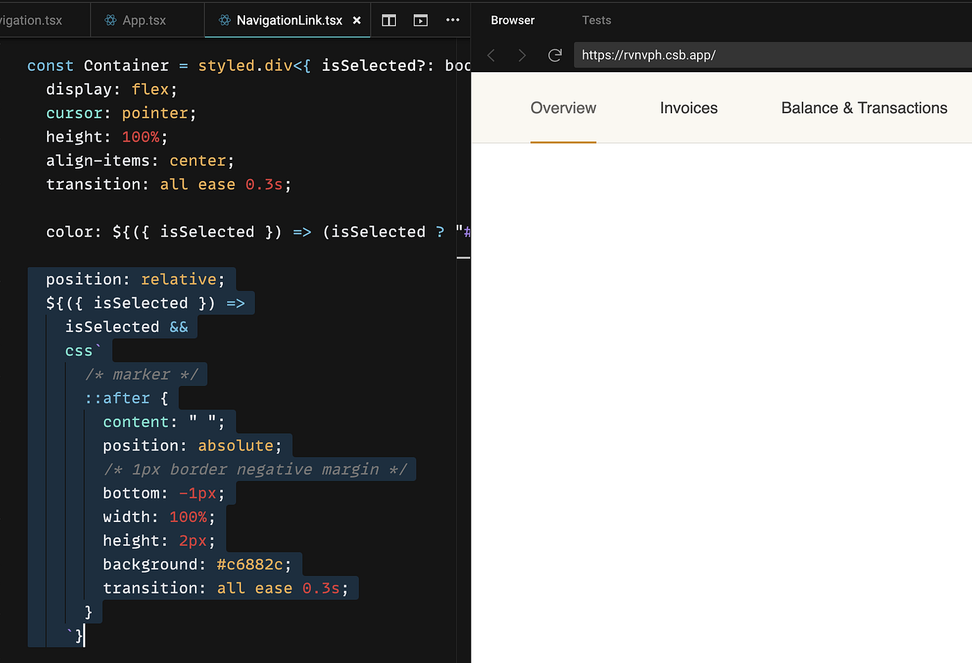
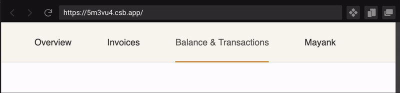
Here is a simple version that gets 90% of the Figma (without the animated highlight). This version uses some simple state to manage the selectedTab. Pretty straightforward! We apply border-bottom: 1px solid #c6882c on the NavigationLink.tsx component to get the highlight.
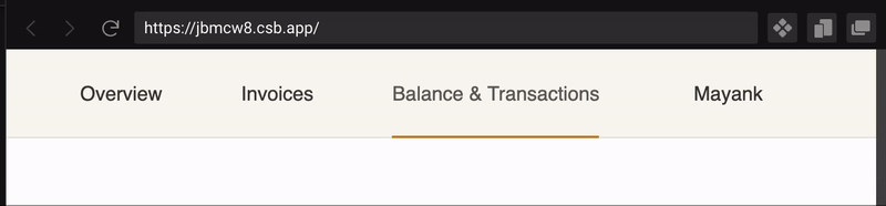
Now let’s solve all the problems one by one. I see in pixels, so I noticed that the highlight in the Figma intersects with the border of the Navigation Bar and does not sit just above it. In the below screenshots, you might notice that the one on the right has the highlight 1px above the border.


Part 2: 95% there — ”B to B+”
We can solve the marker not overlapping with the border issue by ditching our border-bottom highlight idea on the NavigationLink.tsx component, and make the highlight a CSS pseudo-element that is absolutely positioned.
This is better! We now have the line overlapping with the Navigation Bar border.
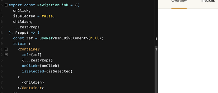
Enough procrastination, let’s get the animation working. As we saw in the Vercel demo, there is only one element that is moving and changing sizes to apply the highlight. In our simple version, we have each NavigationLink add a CSS pseudo-element to get the highlight. So, we need to move this element one level up to the Navigation.tsx component and manipulate the width and position there because we’ll no longer be able to do width: 100% to fill the NavigationLink.tsx component.
How do we get the width and x coordinate?
We can use a React ref and pass it to the main container inside the NavigationLink.tsx component and use the getBoundingClientRect API to get the width of the link.
getBoundingClientRect returns a DOMRec object that has anx coordinate too, but we will avoid using that because it’s the position from the left corner of the browser and not an offset position from the parent container.
Luckily, HTMLElements have an offsetLeft field on them, so we can use that.
Now we need to start thinking about our MarkerPosition . This will store what x coordinate we want, and what width we want for our marker.
Let’s create a hook called useNavigationMarker that will
- Store the
MarkerPosition - Give us an
onSelectmethod that takes arefof theNavigationLinkcalling it, and updates theMarkerPositionbased on the fields available.
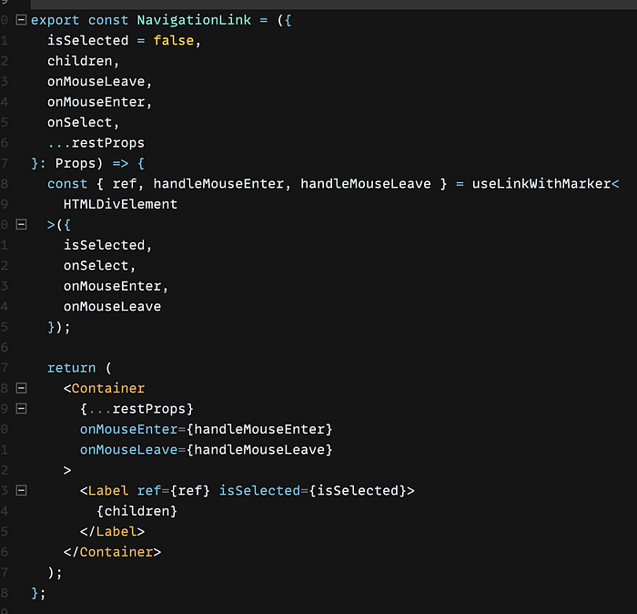
We use this hook in Navigation.tsx , and pass the handler to all of the NavigationLink.tsx components. The {...markerPos} passed to our NavigationMarker.tsx component updates the CSS to move it around.
The purpose of the pseudo-element was to piggyback off the parent (NavigationLink) width so that we didn’t have to explicitly set the width for the marker. Now since we’re doing that for the animation, let’s also do some cleanup and convert the marker from a pseudo-element to a component that is absolutely positioned alongside all the NavigationLink.tsx components inNavigation.tsx so that we only have one marker that we manipulate with the hook we just made.


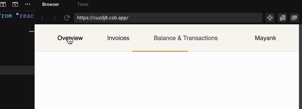
Here is the result that we get by using this hook in Navigation.tsx .
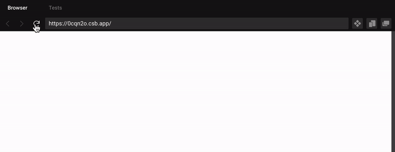
Here is the CodeSandbox if you want to play around with it in this state:
Part 3: 96% there — ”B+ to A-”
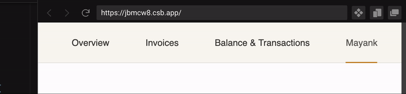
You might have noticed that there are a few bugs, and some features are missing!
- If you look a the last GIF, you’ll notice that when you refresh the page or load the page initially, the bar doesn’t show up. That happens because we only know the
widthandxposition when we click on something! But since this is a Navigation component, one of these links might be selected already because of the URL. We want some way to update theMarkerPositionwhen the page loads. - We need to implement the hover actions on the links so that the highlight temporarily moves to the button that the cursor is on, and goes back when it is not being hovered on anymore.
To update MarkerPosition on page load, we can put a useEffect hook in the NavigationMarker component that runs onSelect when the component re-renders. We can update the onSelect to return early if isSelected is false. This way, the onClick changes the selected route, isSelected changes, and NavigationMarker re-renders. This re-render triggers the useEffect that will update the MarkerPosition .


To get the mouse hover effect, we need to implement a onMouseEnter and onMouseLeave on the NavigationLink . When the user hovers on another link that isn’t selected, we want the NavigationMarker to move to that link temporarily, and then when the user moves their mouse away, we want it to go back to the link it was originally (the current selected one).
We can achieve this by updating the MarkerPosition state and adding a prevX and prevWidth where we can store the previous position. Then, onMouseEnter can set prevX and prevWidth to current x and width , and we can set current x and width to the new NavigationLink the user is hovering on. onMouseLeave can set current x and width to prevX and prevWidth . We also want to check if the element triggering onMouseEnter or onMouseLeave because we want to no-op when the user hovers over the current selected element.


Here is the sandbox for the project in this state:
Part 4: 97% there — “B+ to A-”
We’ve made some really solid progress until this point. We still have a few small requirements to take care of. For example,
- The Figma GIF has the
NavigationMarkerthickness increasing when the user hovers on a non-selectedNavigationLinkand then shrinks when the user clicks on that link. - There is a weird bug when the user moves over other links that are not selected. We see the
NavigationMarkerjumping from between the hover element and the currently selected element.
For the height animation, we can add to our NavigationMarker state and give it a height. We don’t need a prevHeight because the selected state height is constant.


onSelect and onMouseLeave will set height to ACTIVE_MARKER_HEIGHT_PX and onMouseEnter will set height to HOVER_MARKER_HEIGHT_PX .
To fix the bug where NavigationMarker jumps on hover, we can change the styles of NavigationLink from using a margin-right: 64px to using padding: 0 32pxso that all the NavigationLink components are touching each other edge-to-edge. That way, when we move our mouse on non-selected elements, the gap between two NavigationLink components doesn’t exist.

margin-right: 64px to padding: 0 32px.Here is the sandbox for the project in this state:
We now have a pretty good setup very close to the design. But how robust is it? The last few parts cover making this component more robust with some edge cases.
Part 5: 98% there — ”A- to A”
What happens when we hover on the NavigationMarker while it is temporarily positioned at a hovered link?
Woah, that is a weird bug! We somehow need to prevent hovering on the NavigationMarker . We can apply pointer-events: none . According to MDN:
The element is never the target of pointer events; however, pointer events may target its descendant elements if those descendants have
pointer-eventsset to some other value. In these circumstances, pointer events will trigger event listeners on this parent element as appropriate on their way to/from the descendant during the event capture/bubble phases.
This is exactly what we want! We want a hover on NavigationMarker to keep it exactly where it is.

What happens when the browser resizes and the Profile link moves closer to the other links?
Ah! We forgot to handle this case! The Marker position needs to be updated after the browser is done resizing. We can add a resize event handler to all the NavigationLinks — window.addEventListener(“resize”, handleSelect); . One thing we want to be careful of is too many resize events firing.
In the Codesandbox, this will likely not cause a problem because this project is very lightweight. When I implemented this in our team’s project, resizing the browser was causing the browser to hang (and eventually crash) because of the expensive resize computations.
MDN had a good suggestion in their docs when I was looking up the resize API:
If the resize event is triggered too many times for your application, see Optimizing window.onresize to control the time after which the event fires.
After debouncing the window resize event handler:
While we’re here, let’s do some cleanup and move all the handlers, useEffect hooks, and other hooks from the NavigationLink.tsx into a wrapping hook so that it is clear that all those methods and hooks are meant to support the Marker and add the useOnWindowResize hook to it.
And update the NavigationLink.tsx component to use this hook:
This piece of UI is starting to look pretty robust now!
Part 5: 99% there — ”A to A+”
Now, what if we want to blend this component with the rest of our app? Let’s say the rest of our app has some nice intro animations when the page loads. What happens to our NavigationMarker?
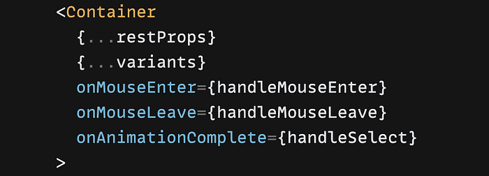
For this example, I’m adding framer-motion to the project, and added some simple fade-in variants to the NavigationLink.tsx component.
Notice how the marker gets stuck in between the links. It seems like the useEffect is running too early and the position of the marker is being updated based on an element that isn’t done animating. In the last GIF, it should be on “Balance & Transactions”. The hint here was that the width of the marker is correct, just the position is wrong.
Upon reading the framer-motion documentation, I found that the motion components have onAnimationComplete prop that is called after the animation defined in animate variant is complete.
So all we have to do is call onSelect when the animation completes. Since
Here is the Codesandbox in its final state!
Final Thoughts
Achieving 99% perfection on this component was as far as I could go, but I admit it’s not flawless. You might notice a slight delay in the highlighted movement when resizing the browser, especially with right-aligned elements. Unfortunately, I couldn’t find a way to make it instantaneous, and without using a resize event handler.
Perhaps this component is either over-engineered or under-engineered for your purposes. It’s heavily tailored to fit our design library at Outgo, so it may not be as helpful for other use cases. However, this post intends to highlight (pun intended) how much effort and thought goes into perfecting small UI effects to deliver a delightful user experience.
In this post, I walked you through my iterative process while building UI components like a Navigation Bar. Although it took me about two hours to build the component itself, it took me triple the time to write this post. Thank you for reading this far! ❤
If you found this post helpful, please leave a comment below. If there’s enough interest, I’ll consider creating a From 90 to 100% series where I break down how to go the extra mile and deliver high-quality experiences!


